CLIENT
IBM, 2019
ROLE
Visual Design Lead
DESIGN TEAM
Thiago Barcelos
Amy Millet
Jordan Smith
Dawn Ahukana
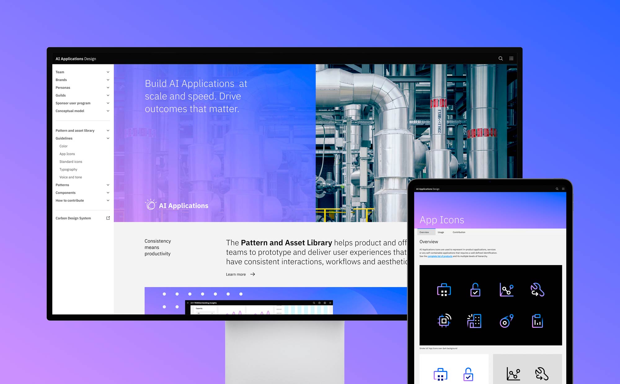
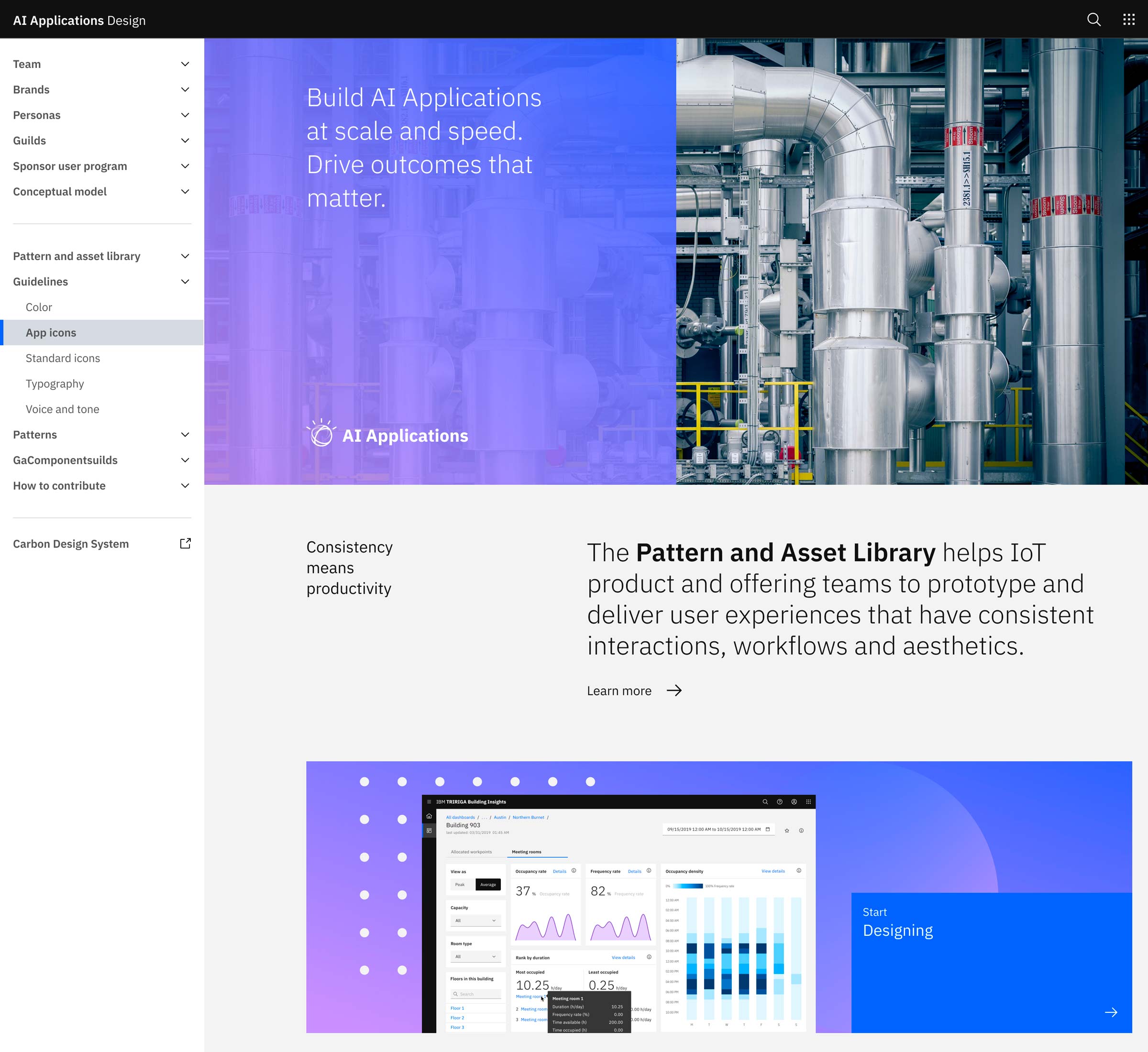
IBM AI Applications visual design guidelines
Presentation layer of the Pattern and Asset Library initiative that consolidates UX patterns and UI components for building cohesive and consistent AI apps.
Business needs
As part of the architectural modernization of all IBM AI Applications portfolio, it became necessary to come up with more consistent visual and UI design standards. The goal was not only to unify the whole ecosystem, but also follow the global movement into Carbon Design System.
Customer needs
While each product worked independently, in most of the cases the customers were the same. Business analysts, reliability engineers, work technicians, among others, face complex and critical problems everyday, so relying on different high learning curve softwares is challenging.
AI industry
High complexity issues, health risk and safety environments, asset management and maximum optimization, mass production lines, subject matter experts mastering edge technologies. The artificial intelligence industry requires specific UX patterns that goes beyond bits and bytes.
Approach
Before defining the visual design and presentation guidelines for AI Applications, it was important to understand its complexity. Multiple products with different technologies, specific business rules, use cases and scenarios. So first our team did a huge inventory library that helped us to identify the most commom patterns.

The next step was to align our strategy to the overall IBM, combining the IBM Design Language, Carbon Design System and Watson Brand guidelines, to have a basis for defining the AI Applications flavor.
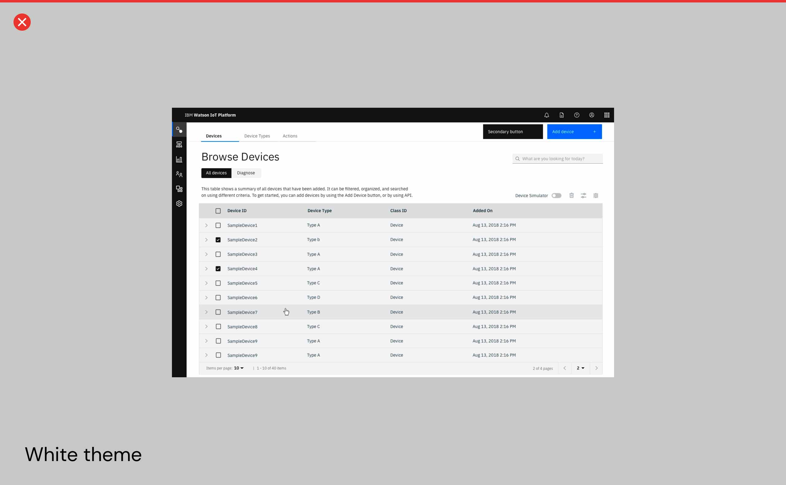
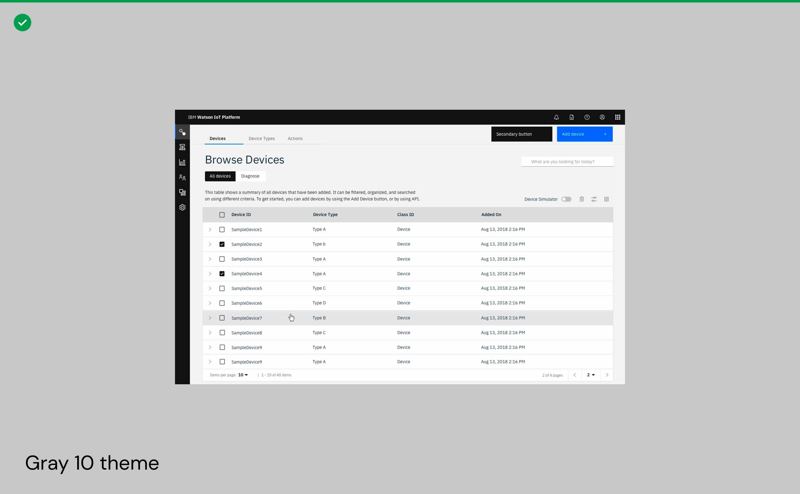
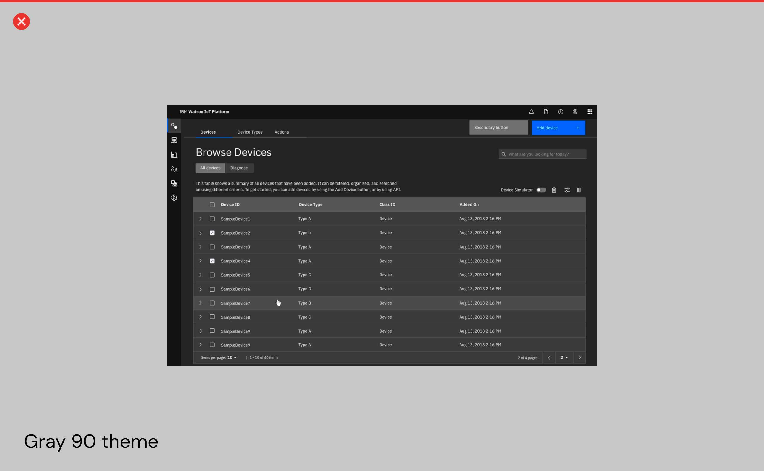
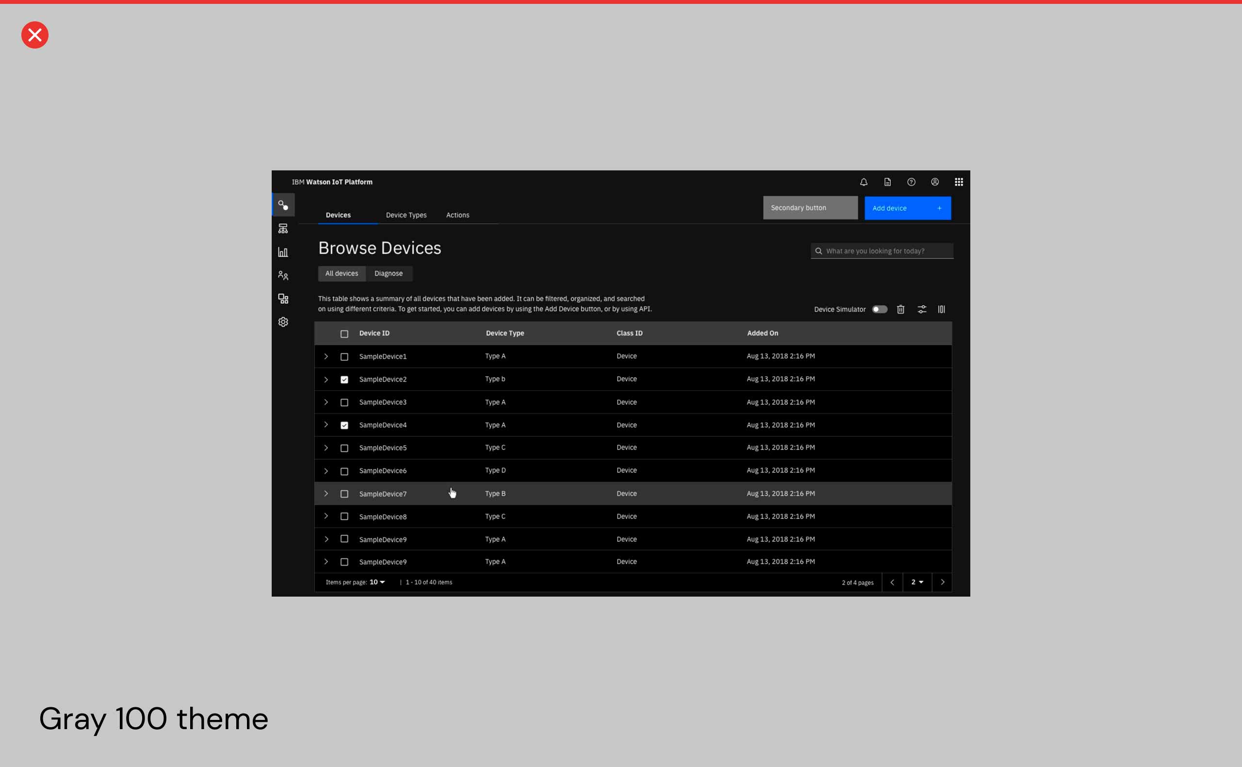
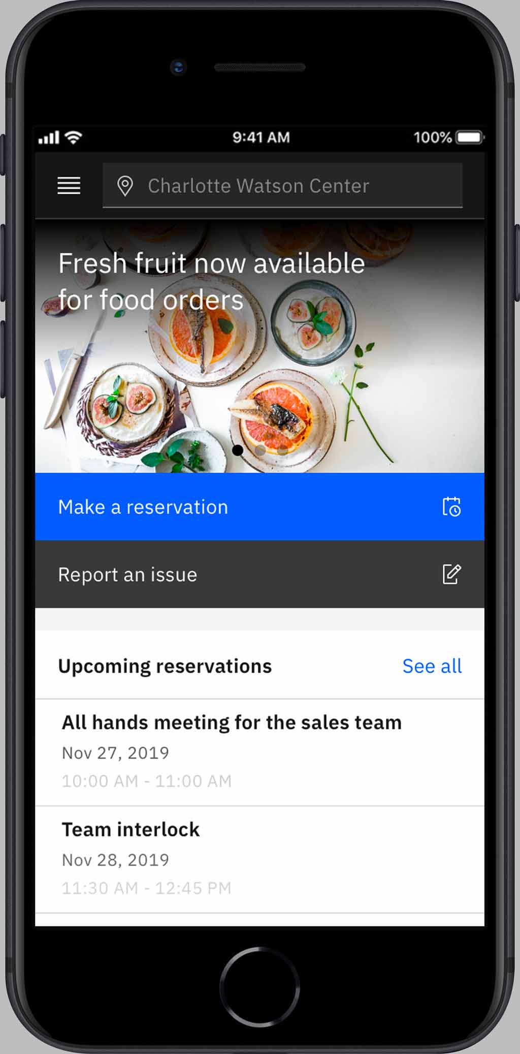
The team split into exploration fronts and redesigned key product screens based on the different themes provided by the Carbon Design System, such as White, Gray 10, Gray 90 and Gray 100.
It became clear for us that the Gray 10 would be the right choice once it allows better contrast for complex dashboards, data visualizations and tables on top of white tiles which, in turn, could be separated from each other over the darker gray background. Also, its resemblance to some current product screens was important not disrupt existing users.

Gray 10 theme color palette with the blue-purple gradient for AI moments

Simplification of the IBM Productive type set, with minimum variations
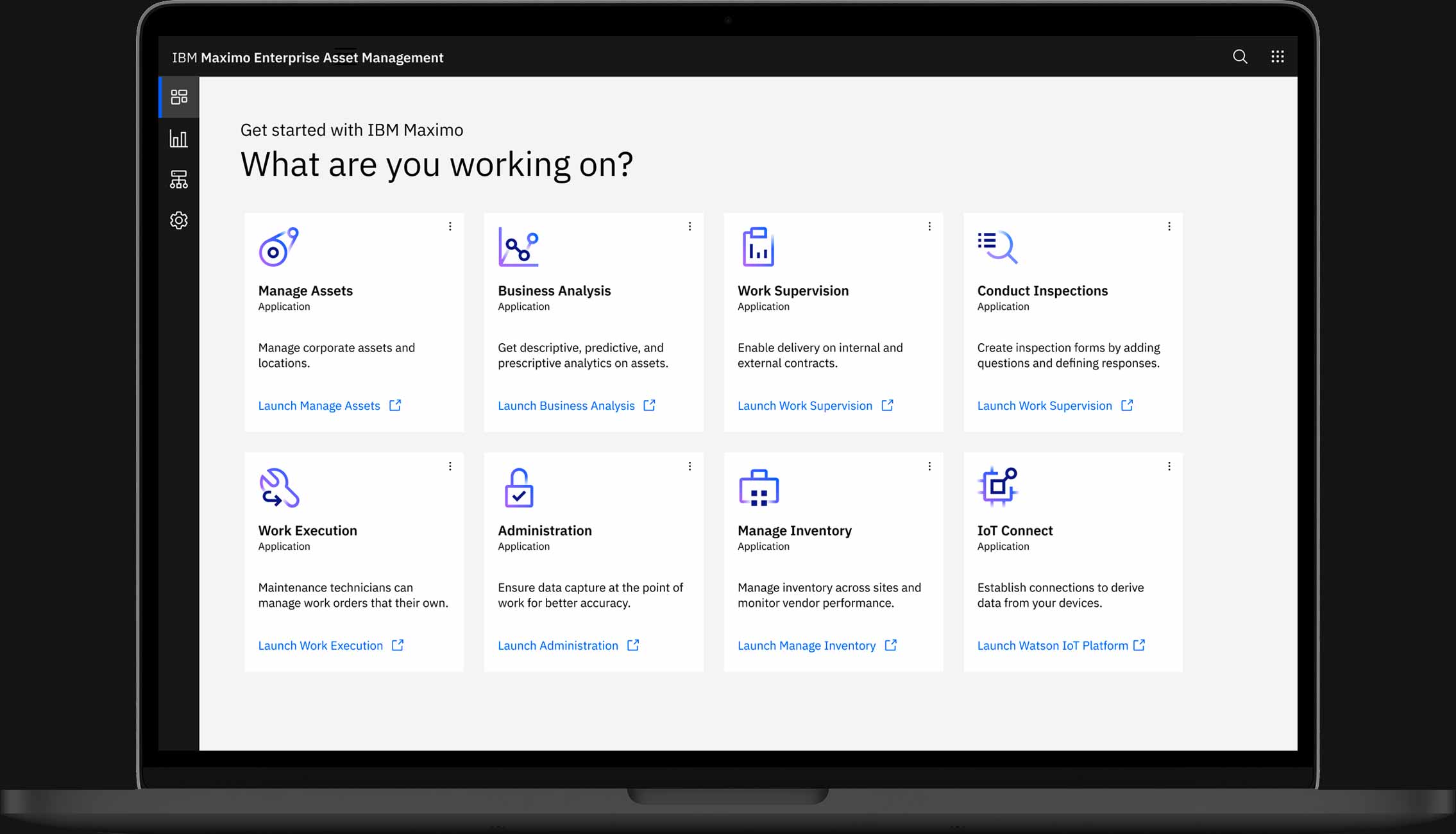
AI Applications design website and product screens
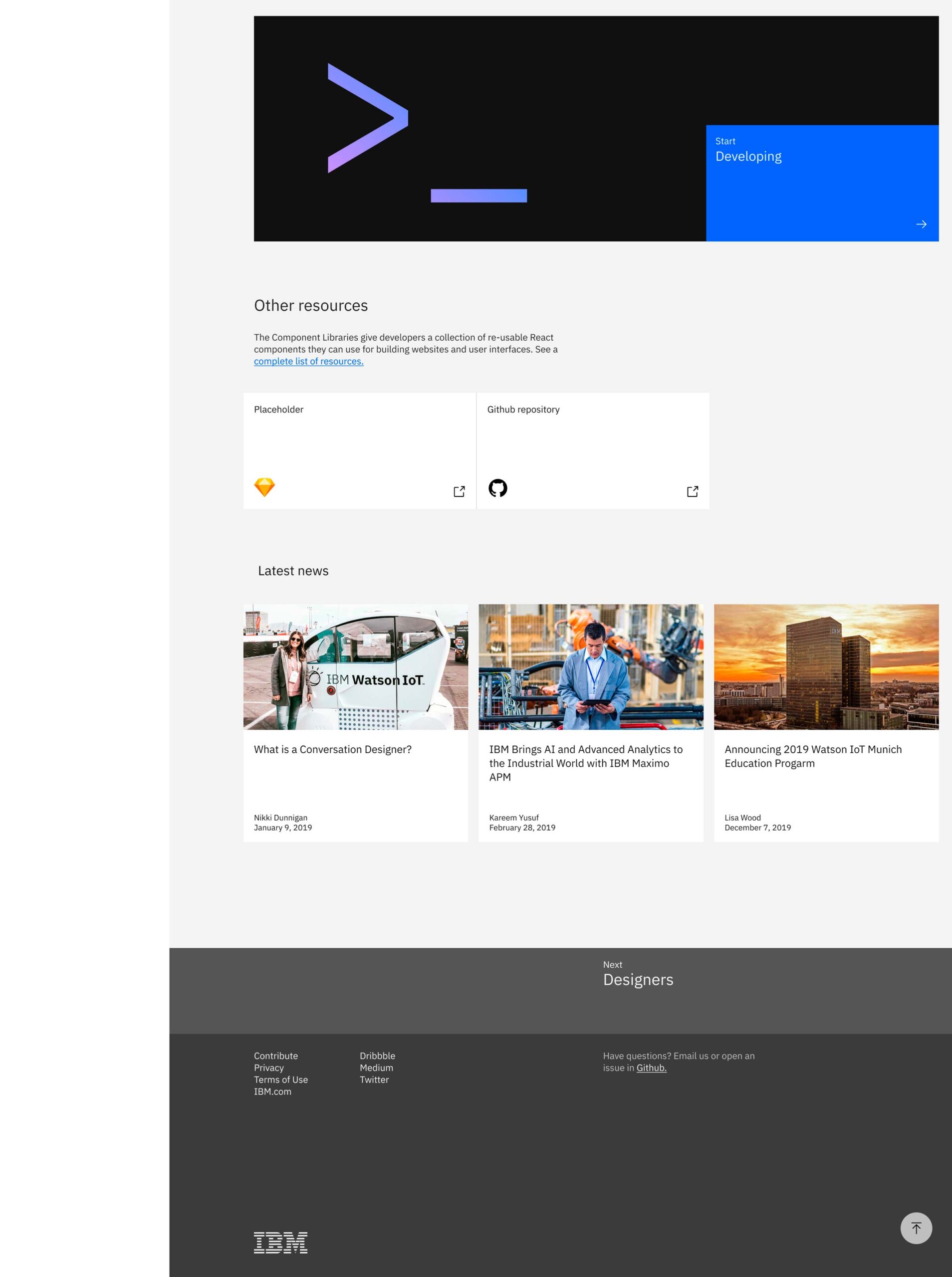
To accomodate the design guidelines and recommendations there was built a website that ended up becaming the single source of truth for the design chapter as well as for engineers, executives and whoever needs context about design at IBM AI Applications.
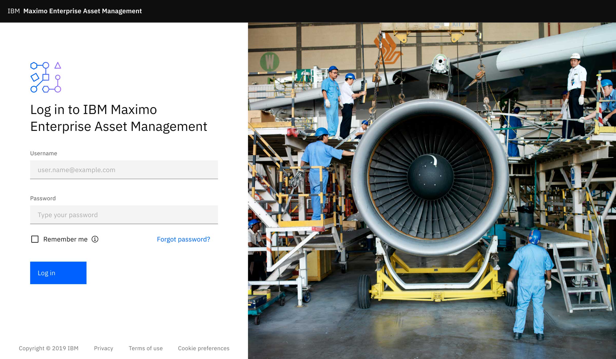
Sample of login screen design pattern
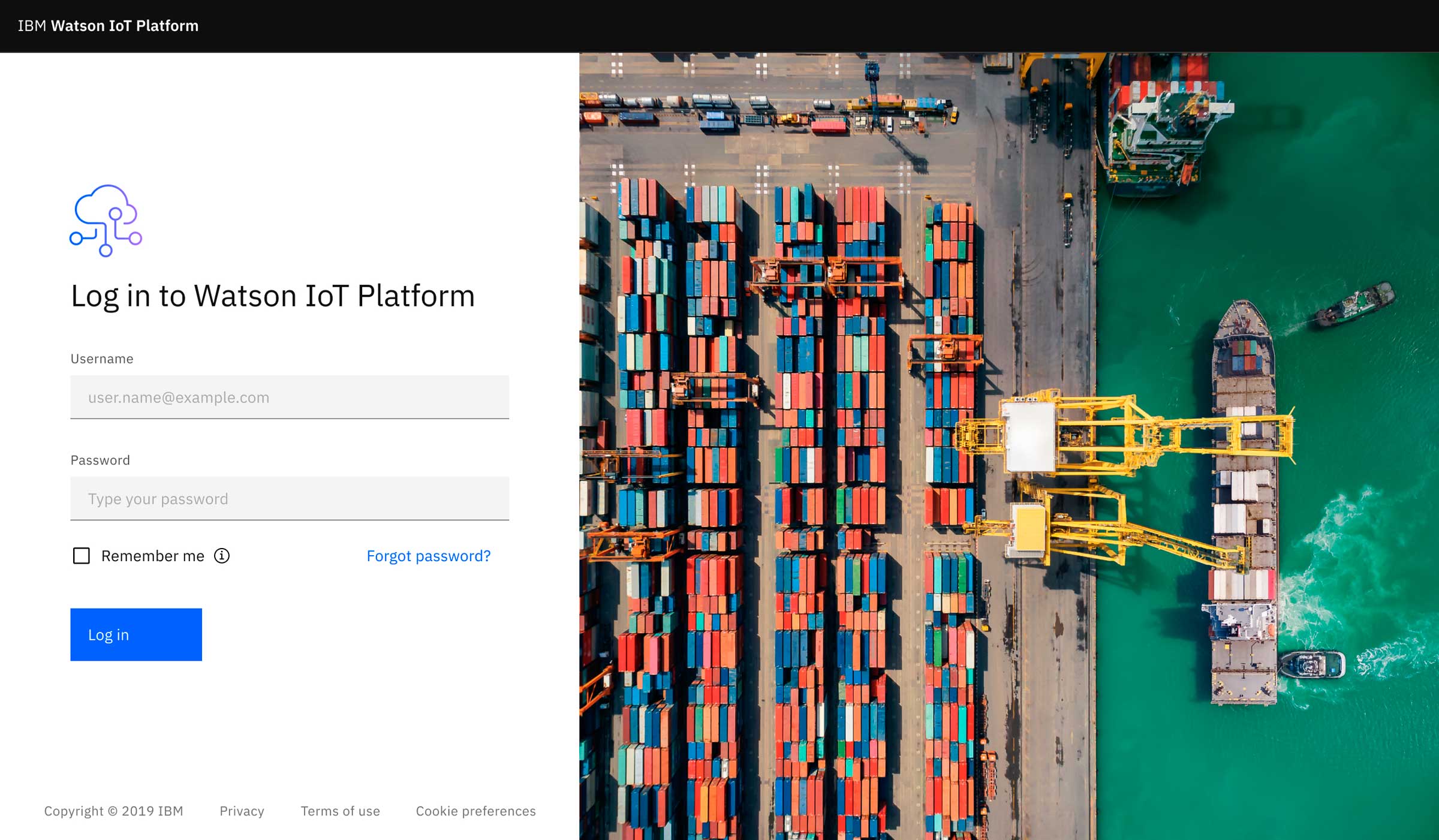
Variation of login screen for different product
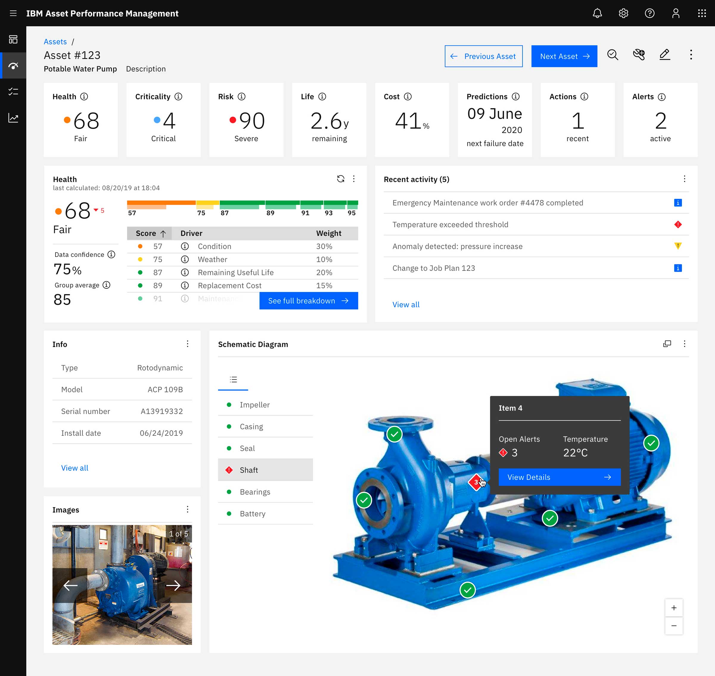
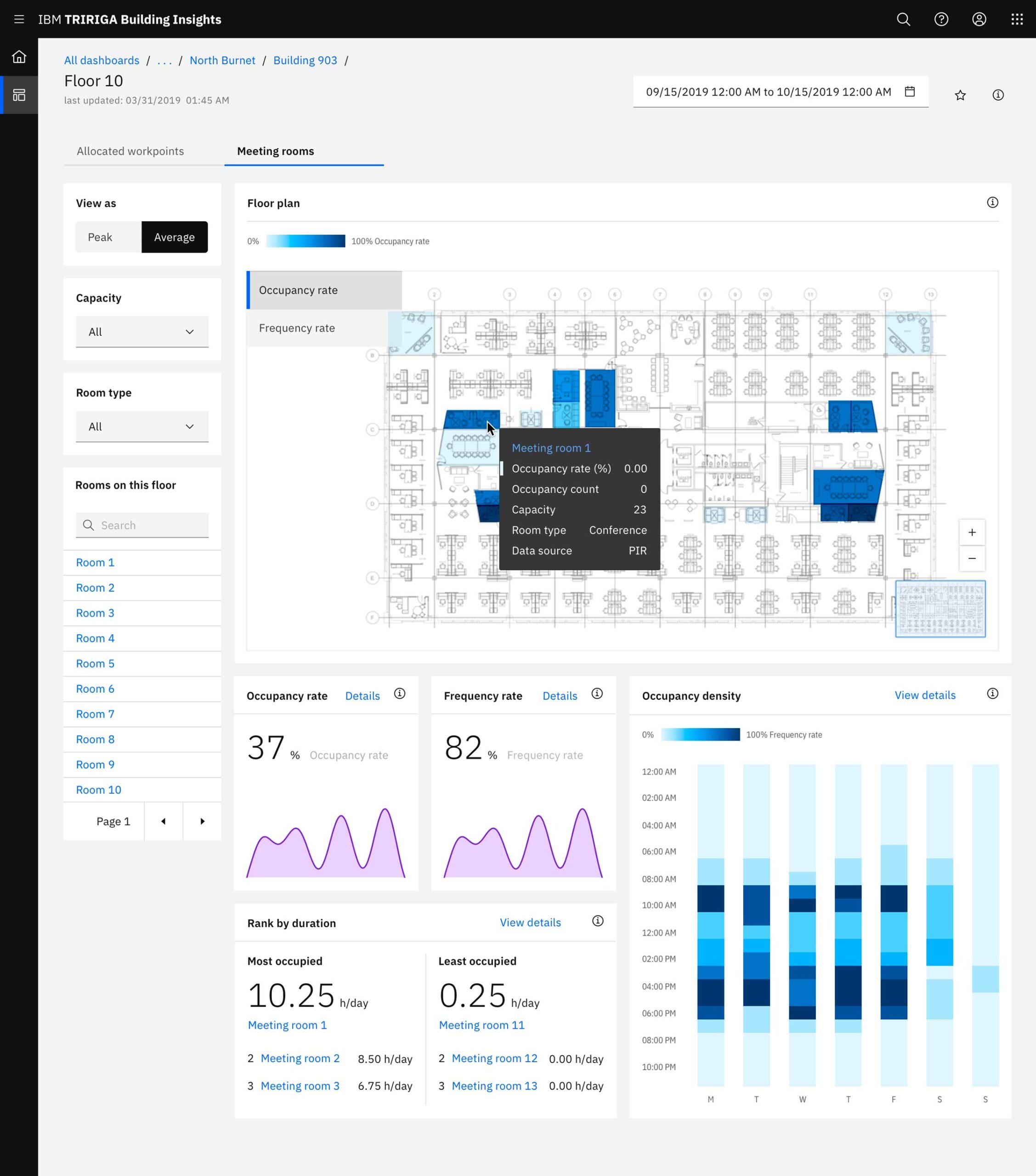
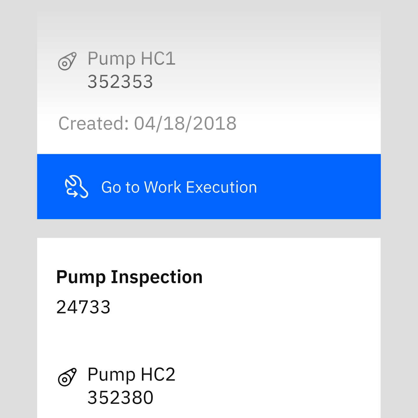
Sample of dashboard with complex data visualizations
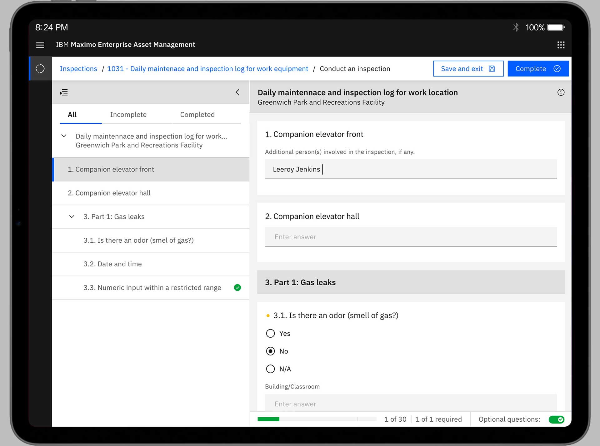
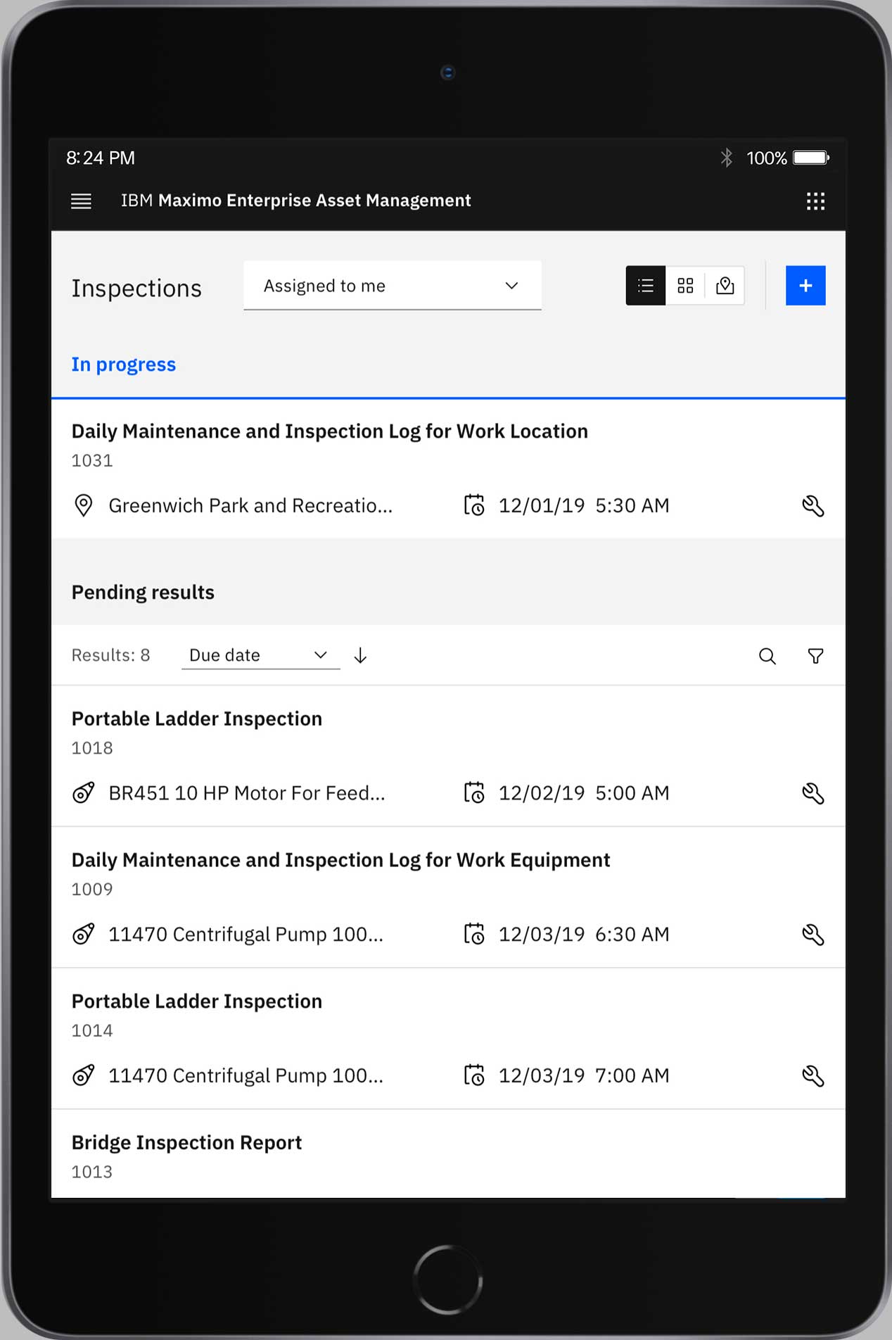
Responsiveness to different form factors
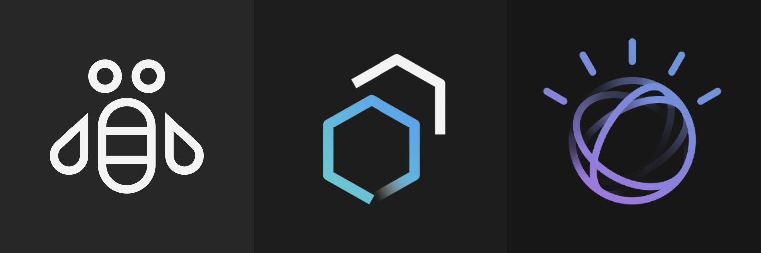
Application icons
There is a huge variety of products under AI Applications. Each one with many other sub applications and services within. So first we catalog and worked with the branding and naming team in order to simplify the conventions. Than I worked on redesigning the current icons and creating the standards for the future ones.
Icon grid
Color variations
To differentiate the AI Applications app icons from the overall IBM ones, we defined a unique gradient that starts from the smart purple flowing to the core IBM blue one, as it follows.

